1.0 Critiques and Suggestions for Current Visualisation
1.1 Clarity
| S.N | Critiques | Suggestions |
|---|---|---|
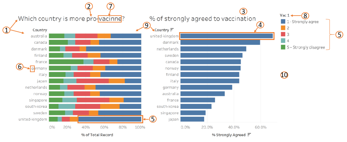
| 1 | The left bar chart is showing the responses received from the question “If a Covid-19 vaccine were made available to me this week, I would definitely get it.” and not “Which country is more pro-vaccine?” The title confuses readers as readers may be expecting a country rather than “1 - Strongly agree” to “5 - Strongly disagree”. | Use a more appropriate title for the chart e.g. “Willingness of people to get vaccinated if a vaccine is made available to him/her this week.” |
| 2 | There’s no notes to define what is considered as “pro-vaccine”. Will responds of “1 – Strongly agree” and “2” be considered as “pro-vaccine” or only a responds of “1 - Strongly agree” be considered as “pro-vaccine”? Or will “3” also be considered as “pro-vaccine”? | Include a note to indicate what “pro-vaccine” refers to, or to use the same colour (but different tone) for responses classified as “pro-vaccine”. |
| 3 | The chart did not show the confidence interval of the proportion. | Compute the confidence interval and include in the chart. |
| 4 | The scaling of the bar charts are different, the bars on the right chart is longer than the bars on the left chart for the same %. | Amend the scale of the x-axis such that both charts shows same scaling/size, if bar charts are used for both charts. |
1.2 Aesthetics
| S.N | Critiques | Suggestions |
|---|---|---|
| 5 | The colour of categories are all different, which makes it difficult to relate the closeness of e.g. “1 - Strongly agree” and “2”. | Use same colour, but different tone for similar responses. E.g. Dark green for “1 - Strongly agree” and light green for “2”. |
| 6 | Naming of the country should be Caps for the first alphabet. | Caps the first name of the country. |
| 7 | Spelling mistake in the word “vaccine”. | Check the spelling of the word, should be “Vaccine”. |
| 8 | Not clear what “Vac 1” refers to. | Use better title of the chart to reflect what the legends refer to. Alternatively, include a note to explain what “Vac 1” means. |
| 9 | Good use of sorting on the right chart as it clearly shows the top countries that had higher proportion of people who strongly agreed to vaccination. The left bar chart is sorted by alphabetical order which made it difficult to see the top countries that had higher proportion of “pro-vaccine”, will be better if can sort by % of “Strongly agreed” (similar to the bar chart on the right) instead. | Ensure that the charts have the same sorting order for ease of reading/referencing. |
| 10 | Did not indicate the source of the data. | Include the source at the bottom of the charts. |
2.0 Proposed Design
| S.N | Advantages |
|---|---|
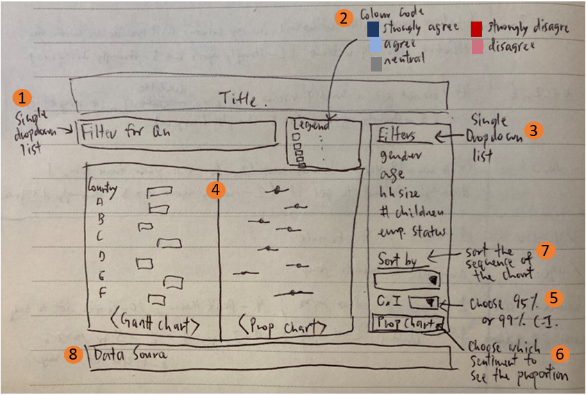
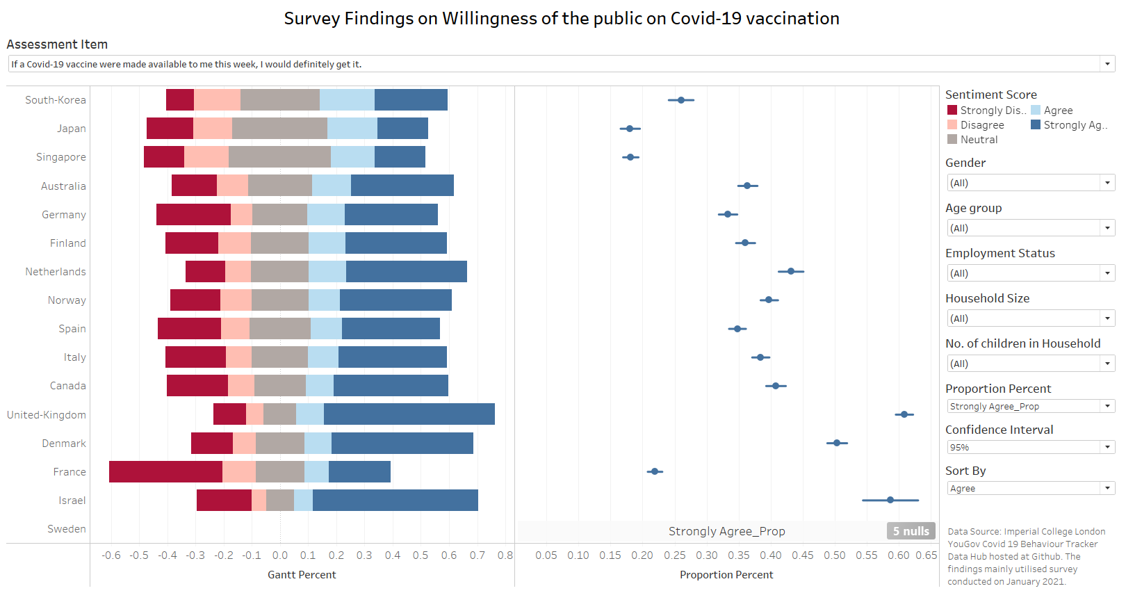
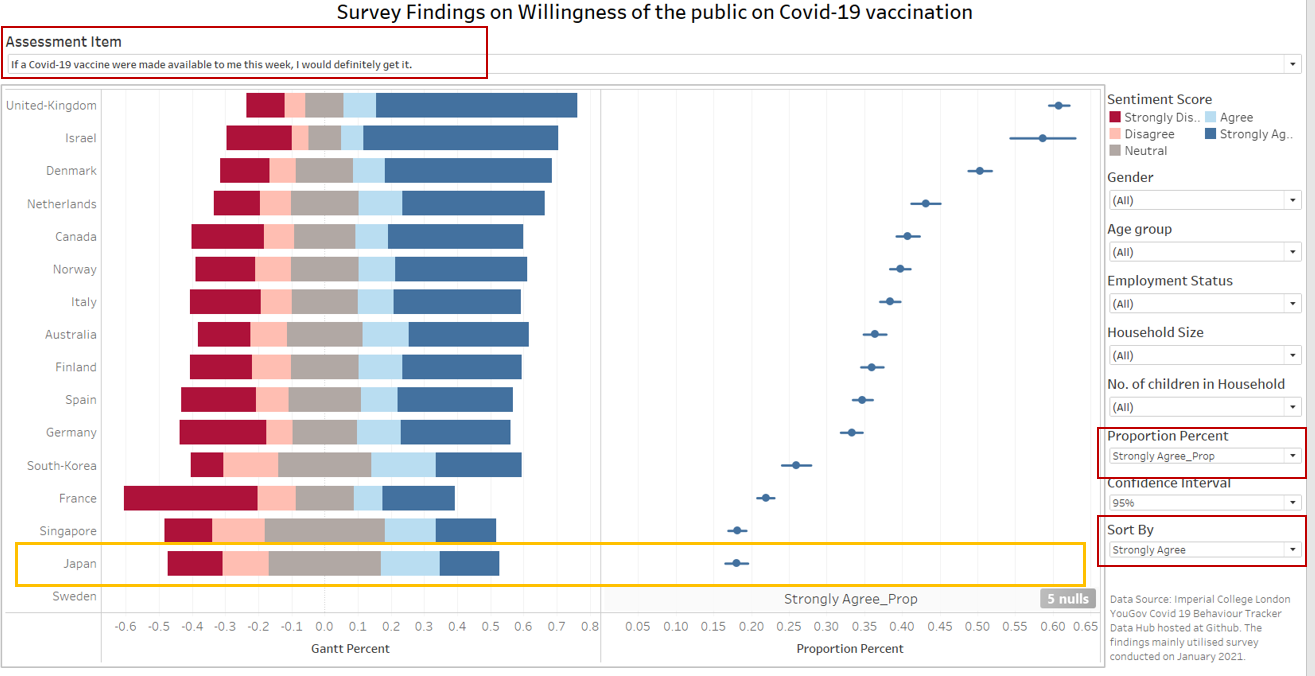
| 1 | Includes survey findings on other questions instead of just on “Vac 1” so that users can have a broader view on the sentiments of respondents. In addition, it shows the exact question asked in the survey for users to see. |
| 2 | For easy reading, suggest that the colour of sentiment scores follow a theme i.e. blue theme for agree, red for disagree and grey for neutral. |
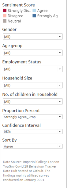
| 3 | Additional filters such as Age, Gender, Household size, number of children in household and employment status will be included as additional features for deeper analysis by users. |
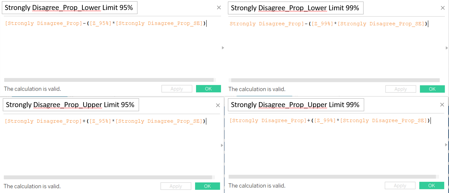
| 4 | Use different type of charts to represent the sentiments i.e. Gantt chart and Proportion chart. For the proportion chart, confidence interval are also included to understand if there are significant difference between the proportions. |
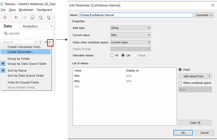
| 5 | Includes option for users to select between 95% and 99% confidence interval, depending on their use case. |
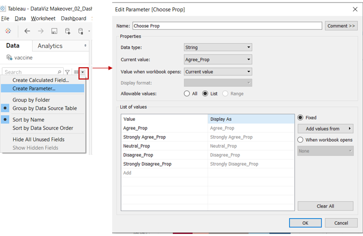
| 6 | Users have the option to choose which sentiment (i.e. strongly agree/ agree/ neutral/ disagree/ strongly disagree) proportion chart they would like to see, instead of only giving users the option of seeing the strongly agree chart. |
| 7 | The “Sort by” filter allows users to sort the Gantt chart according to their preference. For example, users may want to know among the questions, which had the highest disagreement view. |
| 8 | Source of data is indicated and users can easily know where the data is from and download it. |
3.0 Data Visualisation Steps
3.1 Data Preparation
As the datasets consist of many variables and for this makeover, we are only using selective variables, hence follow Steps 1 to 6 to keep only those variables (reduce the size of the dataset for importing into Tableau later) and save out the dataset which will be used in the visualisation.
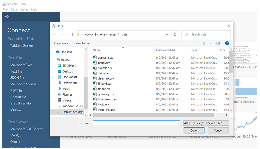
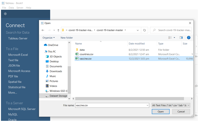
Step 1: Open a new Tableau window, click on ‘Text file’ and navigate to the data file. Select the first country file e.g. “australia.csv”.
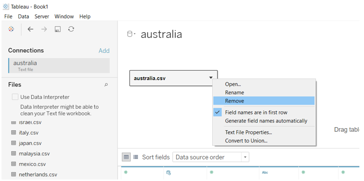
Step 2: Right click “australia.csv” in the pane and select “Remove” as shown below.
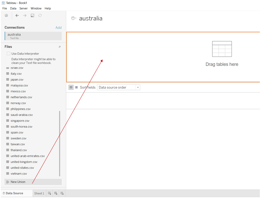
Step 3: Click and drag “New Union” into the pane as shown below.
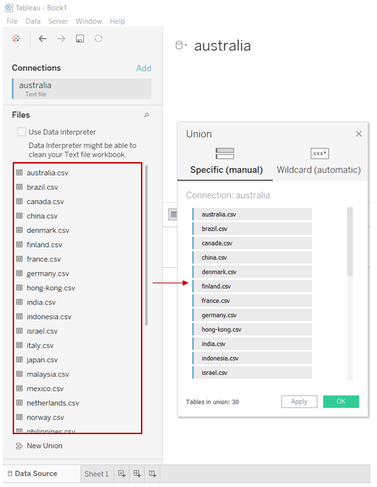
Step 4: Select and drag all the country.csv files into the “Union” pop-up window and click “OK”.
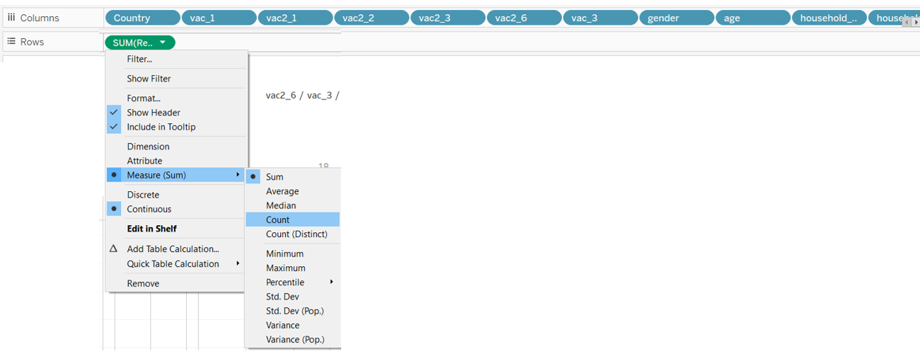
Step 5: Open a new Tableau worksheet and drag “Country”, “vac_1”, “vac2_1”, “vac2_2”, vac2_3”, “vac2_6”, “vac_3”, “gender”, “age”, “household_size”, “household_children”, “employment_status” to “Columns” and “RecordNo” to Rows. Right click “RecordNo” and change to “Count”.
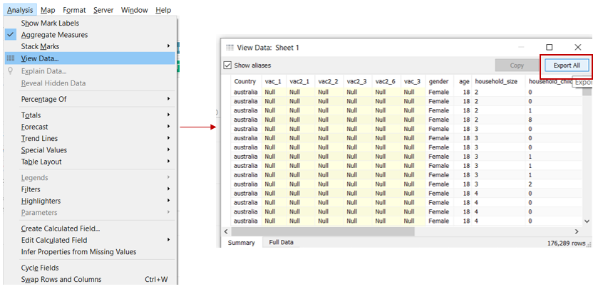
Step 6: Save out the dataset by clicking on “Analysis” tab, select “View Data” and thereafter select “Export All”. Save the dataset as “vaccine” to a folder.
3.2 Tableau Works
3.2.1 Import dataset and create additional variables.
Step 1: Open a new Tableau window, click on “Text file” and open the “vaccine.csv” file save out earlier (Step 6 of 3.1).
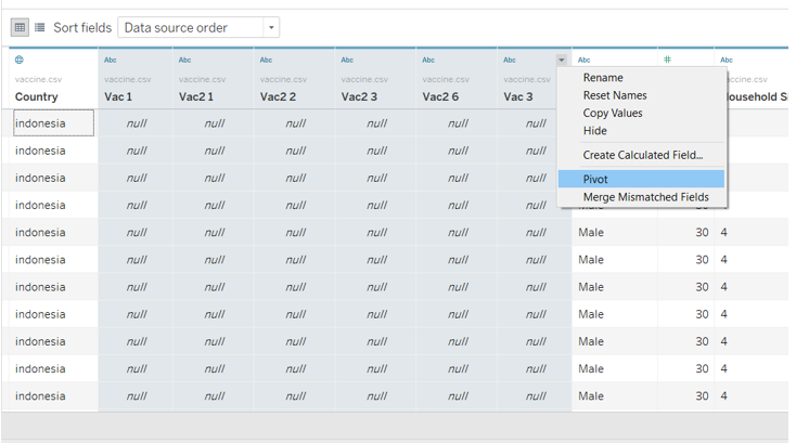
Step 2: Select the highlighted variables, click on the drop down list and select “Pivot”.
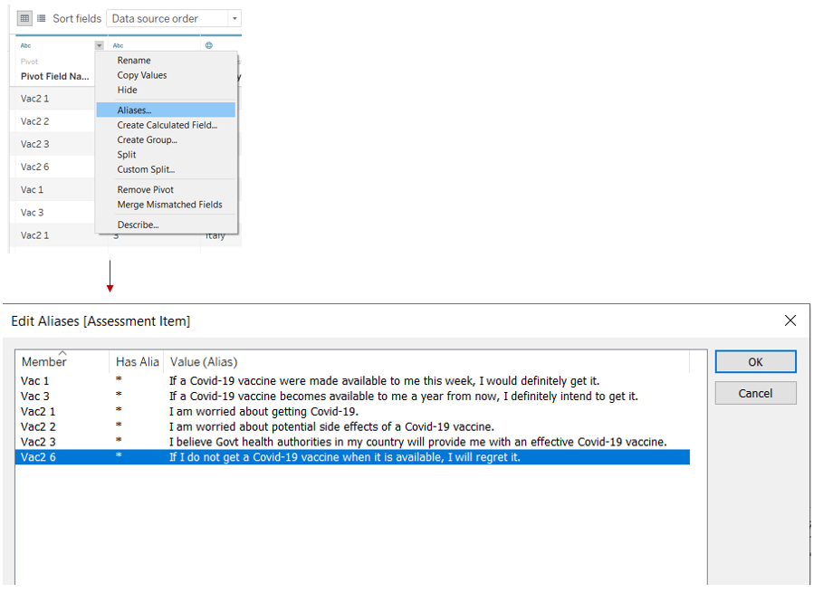
Step 3: Right click the drop down list and select “Aliases”. Edit the “Value (Alias)” column to as shown below and click “OK”.
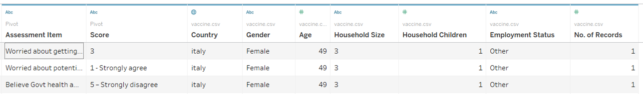
Step 4: Rename the columns to as shown below.
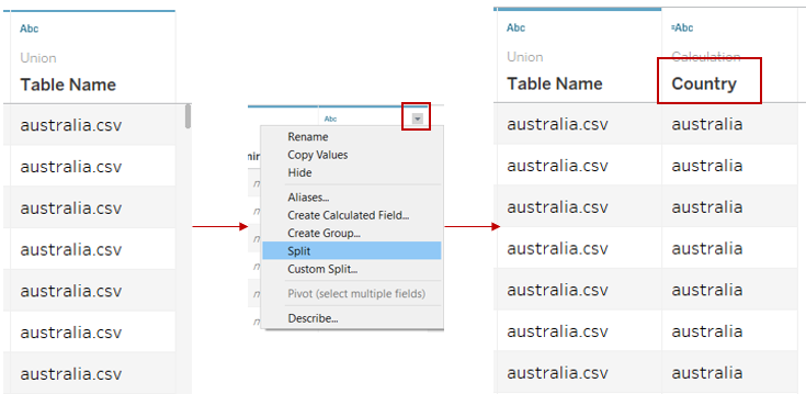
Step 5: Split the column “Table Name” by clicking on the drop down list and select “Split”. Rename the new column as “Country”.
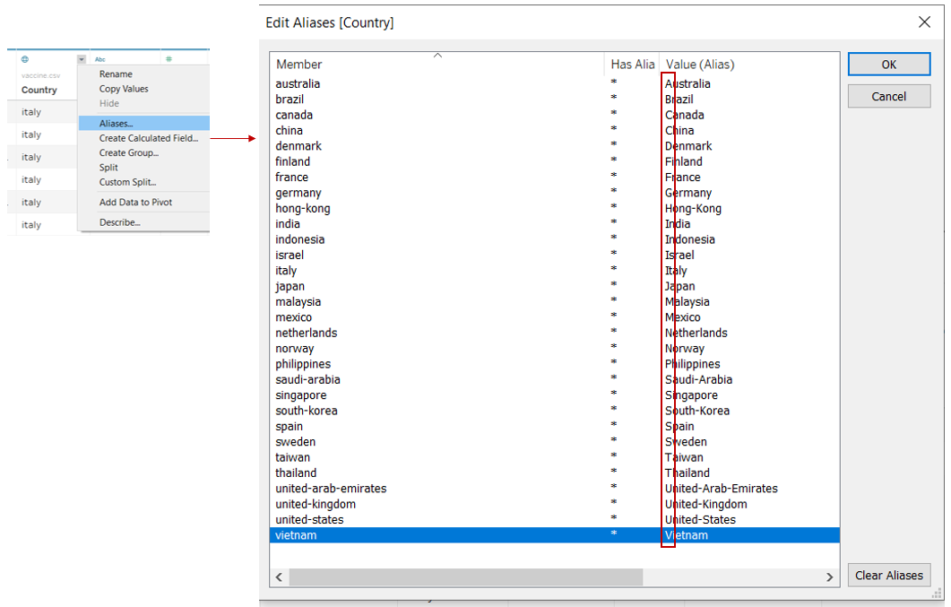
Step 6: Click on the drop down list for “Country” and select “Aliases” and rename the countries to reflect Upper case for the first alphabet of the country name.
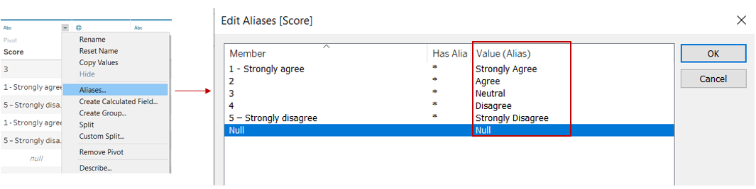
Step 7: Click on the drop down list for “Score” and select “Aliases” and rename the values as shown below.
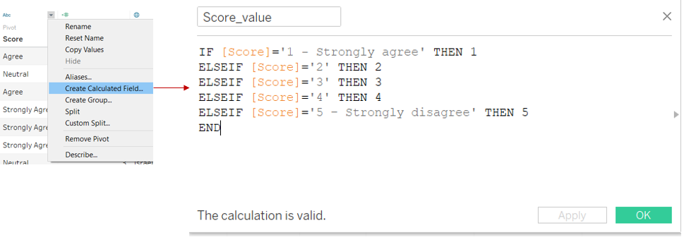
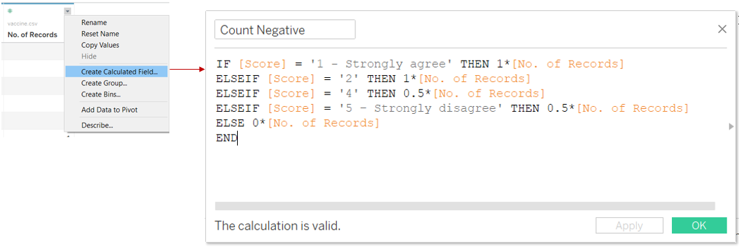
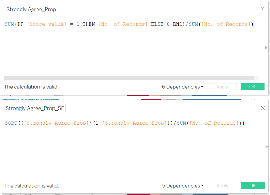
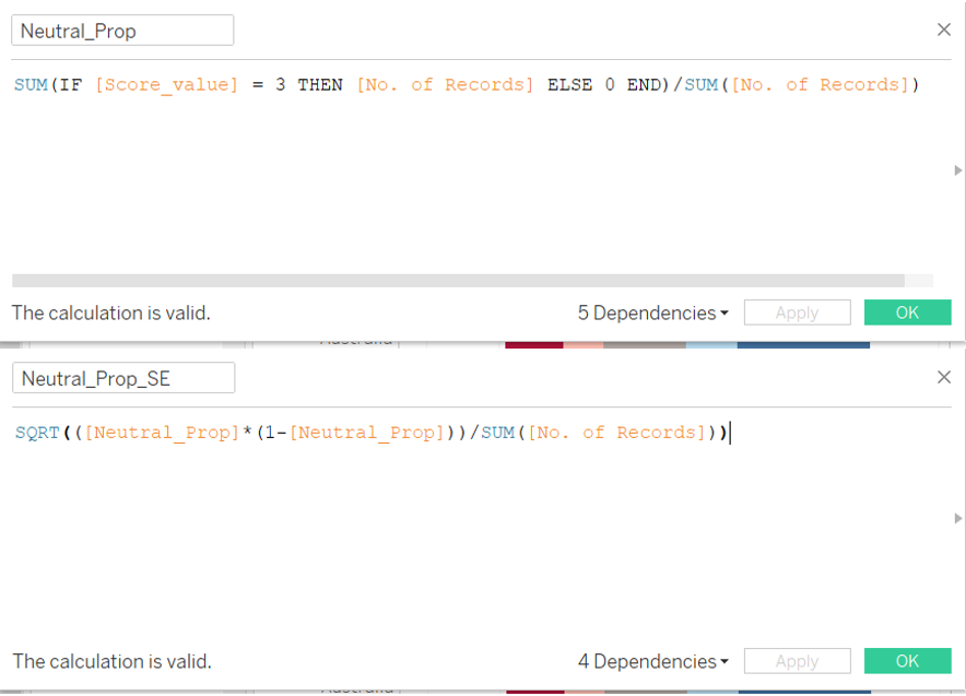
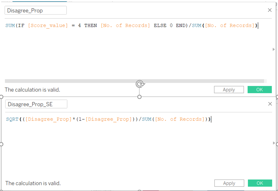
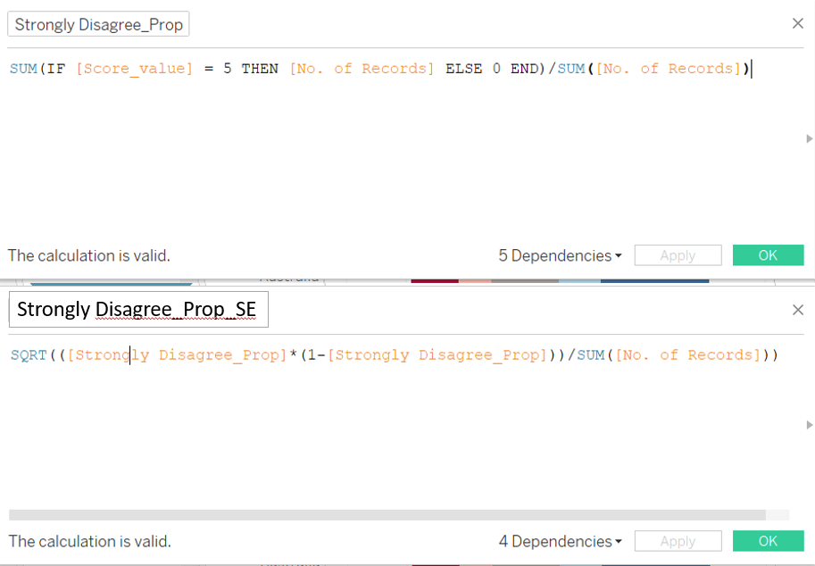
Step 8: Click on the drop down list for “Score” and select “Create Calculated Field”. Input the following formula into the pop-up window.
Step 9: Click on the drop down list for “No. of Records” and select “Create Calculated Field”. Input the following formula into the pop-up window.
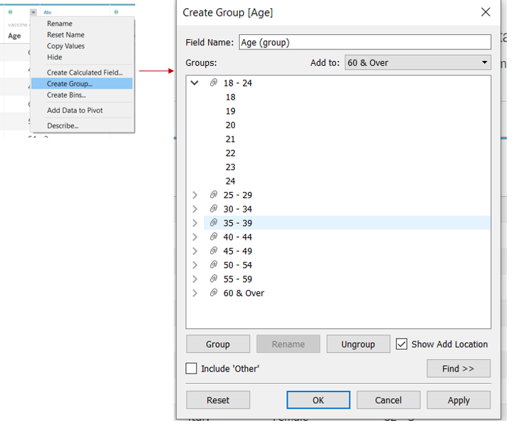
Step 10: Click on the drop down list for “ Age” and select “Create Group”. Create the groups as shown below.
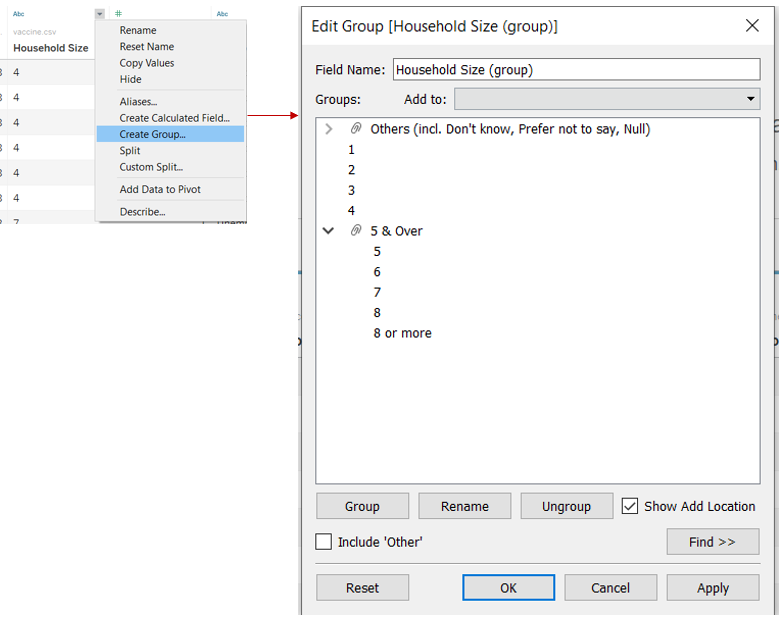
Step 11: Click on the drop down list for “ Household Size” and select “Create Group”. Create the groups as shown below.
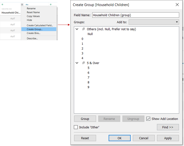
Step 12: Click on the drop down list for “ Household Children” and select “Create Group”. Create the groups as shown below.
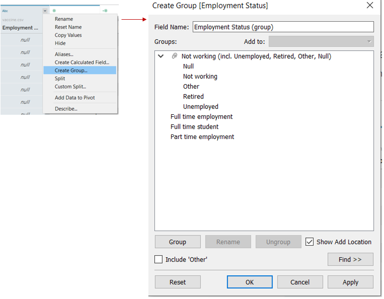
Step 13: Click on the drop down list for “ Employment Status” and select “Create Group”. Create the groups as shown below.
3.2.2 Create Gantt Chart
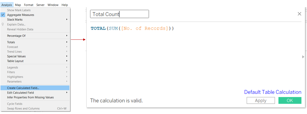
Step 1: Open a new Tableau workbook. Create calculated field “Total Count” by clicking on “Analysis” on the ribbon tab and select “Create Calculated Field”. Input the formula shown below.
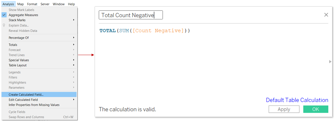
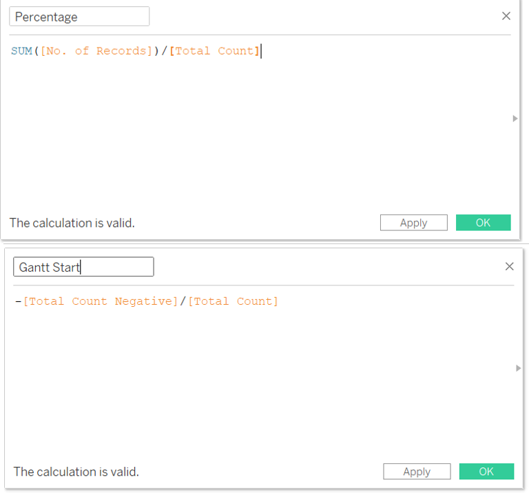
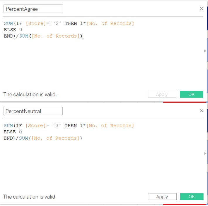
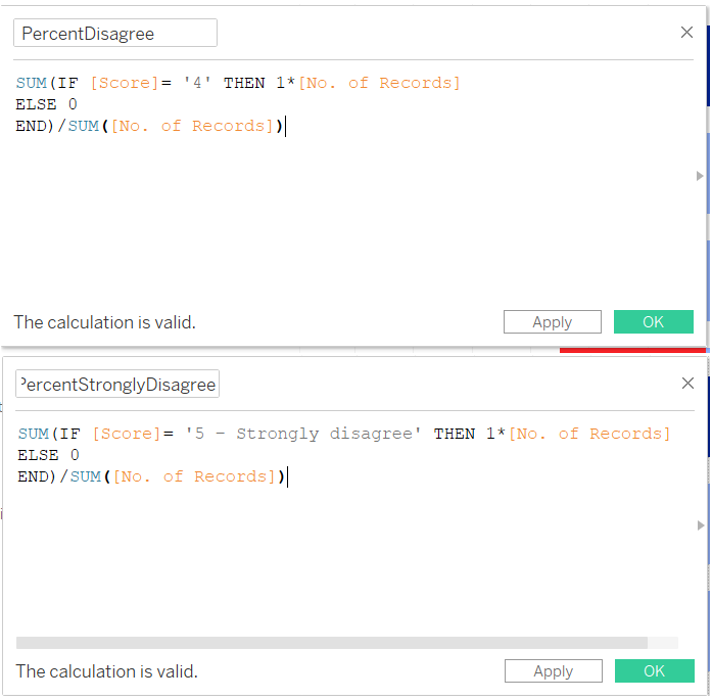
Step 2: Create more calculated fields. Click on “Analysis” on the ribbon tab and select “Create Calculated Field”, input the formula shown below. Repeat the steps to create the other calculated fields shown below.
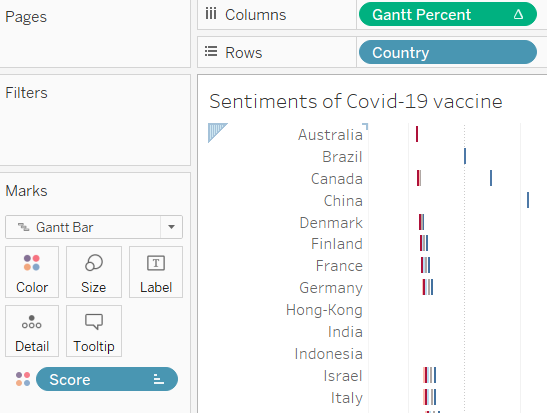
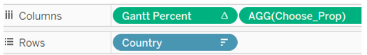
Step 3: Drag “Gantt Percent” into “Columns”, “Country” into “Rows” and “Score” into the colours Marks card as shown below.
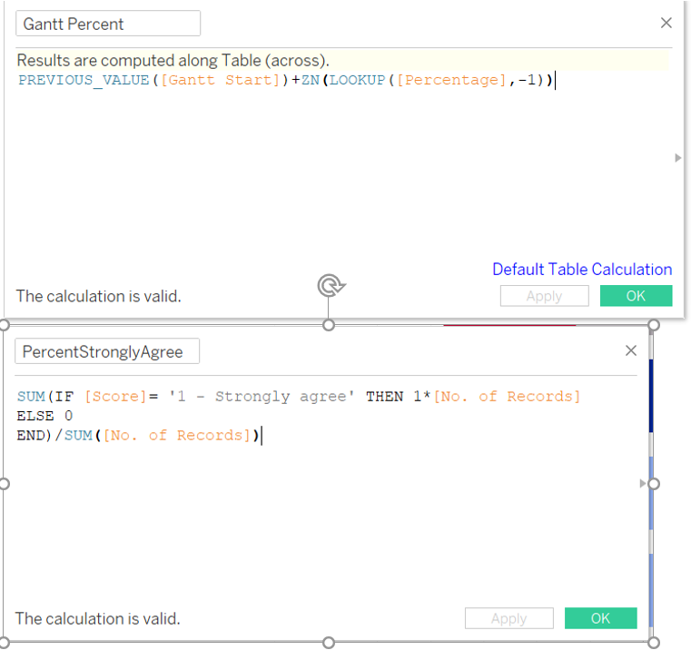
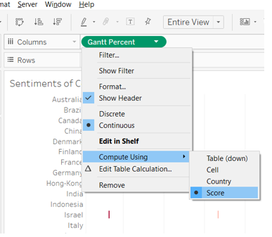
Step 4: Click on “Gantt Percent”, click on “Compute Using” and select “Score”.
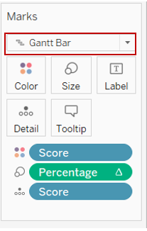
Step 5: Under the Marks card, drag “Percentage” into the “Size” and “Score” into “Detail”. Select “Gantt Bar” from the drop down list.
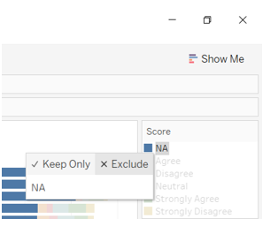
Step 6: In the “Score” card, click on “NA” and select “Exclude”.
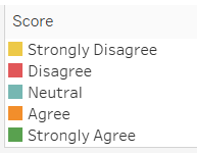
Step 7: Shift the sequence of the Score to reflect the following.
Step 8: Double click on the yellow box and change the colour to as shown below.

Step 9: Drag these variables (in red boxes) into “Filters” as shown below.
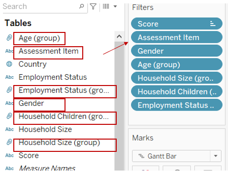
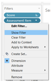
Step 10: Click the drop down list and select “Show Filter”. Repeat to show all the filters.
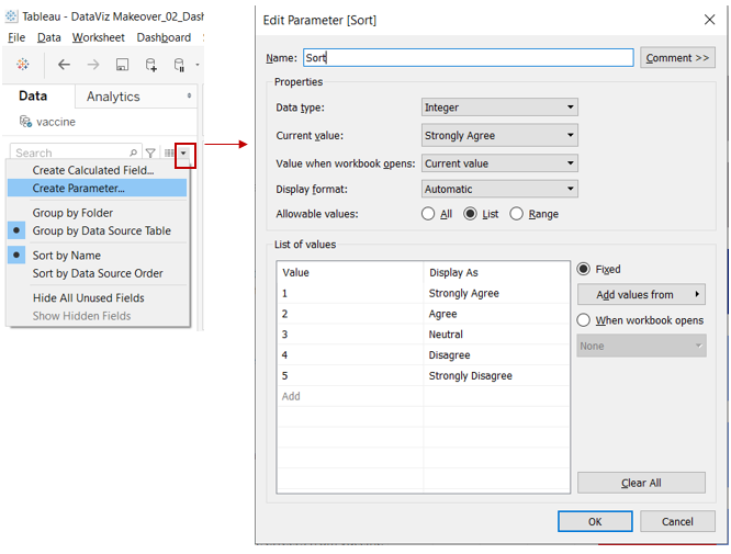
Step 11: To create a sorting option in the visualisation, click on the drop down list, and select “Create Parameter”. Input the values as shown below.
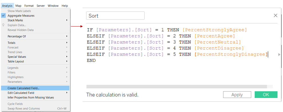
Step 12: Click on “Analysis” on the ribbon tab and select “Create Calculated Field”, input the formula shown below.
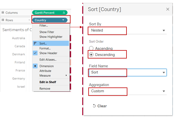
Step 13: Click “Country”, select “Sort”. Select the options as shown below.
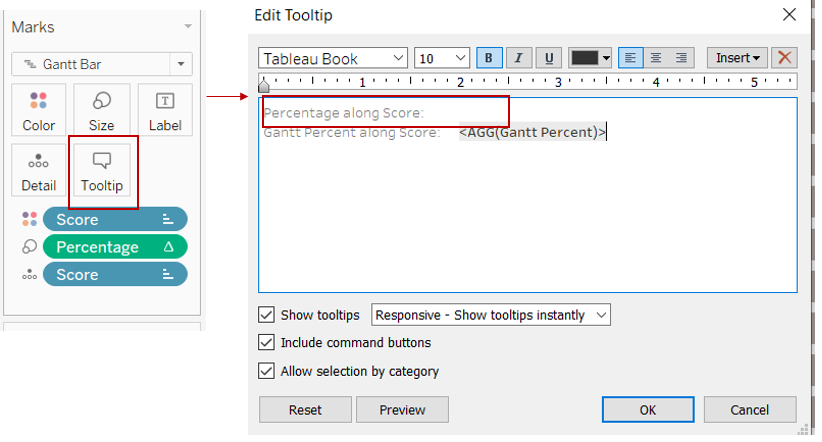
Step 14: In the Marks card, click on “Tooltip”. Remove the first line from the tooltip (in red box).
3.2.3 Create Proportion Chart
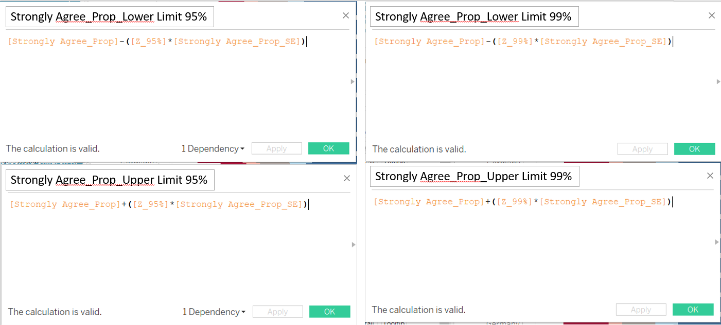
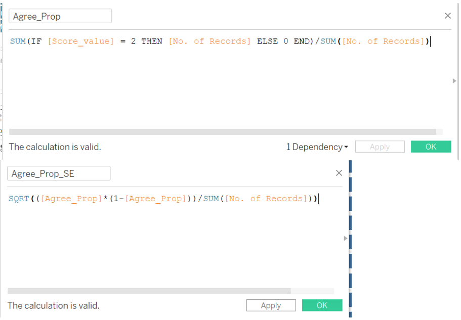
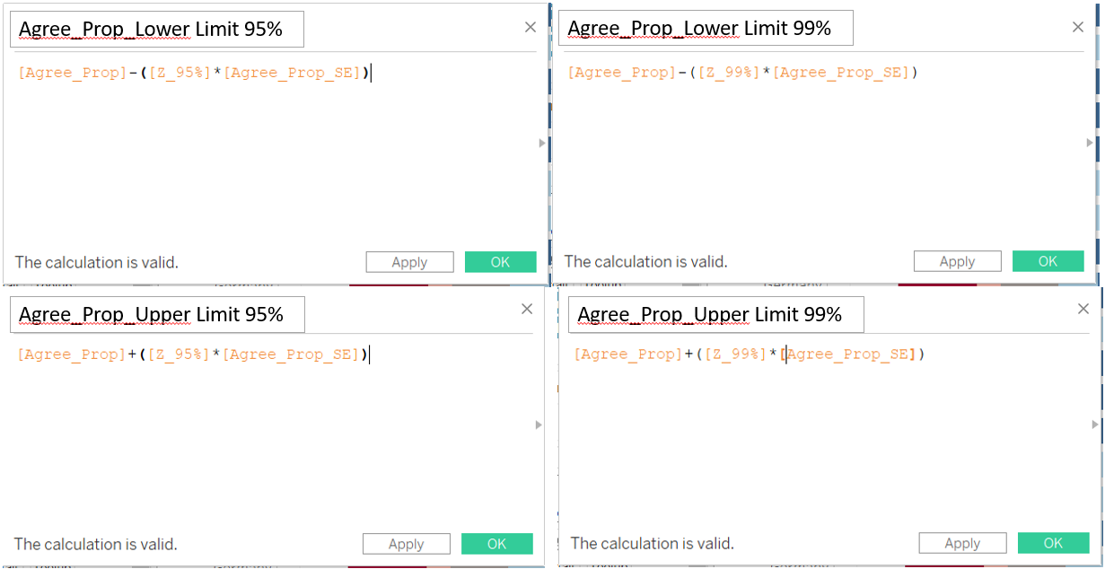
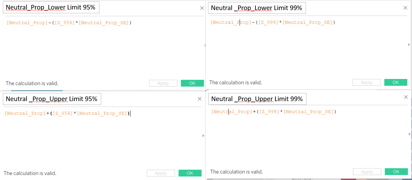
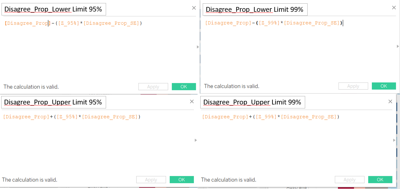
Step 1: Create more calculated fields. Click on “Analysis” on the ribbon tab and select “Create Calculated Field”, input the formula shown below. Repeat the steps to create the other calculated fields shown below.
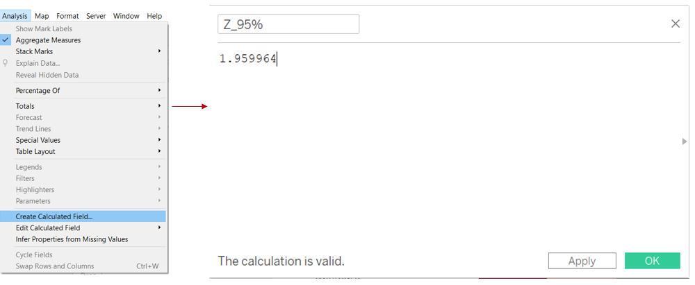
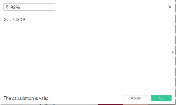
Step 2: To create a dynamic visualisation of the proportion chart (choose which sentiment to filter and at which Confidence interval), click on the drop down list, and select “Create Parameter”. Input the values as shown below.
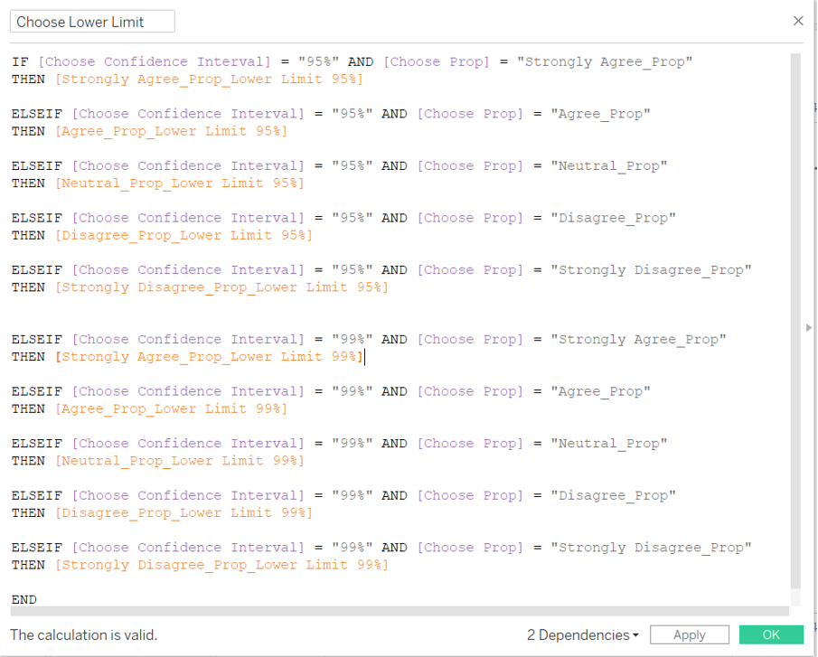
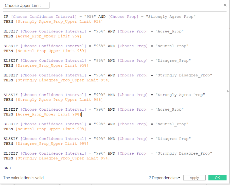
Step 3: Create more calculated fields. Click on “Analysis” on the ribbon tab and select “Create Calculated Field”, input the formula shown below. Repeat the steps to create the other calculated fields shown below.
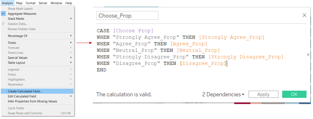
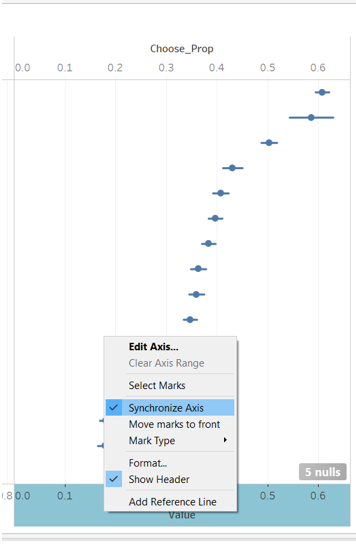
Step 4: Drag “Choose_Prop” into “Columns”.
Step 5: Pull “measure value” to the top of the chart (along the top of x-axis). In the Measure Values card, keep only “AGG(Choose Lower Limit)” and “AGG(Choose Upper Limit)”.
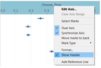
Step 6: Click on the x-axis and select “Synchronize Axis”.
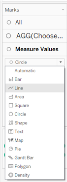
Step 7: In the Marks card, change “Measure value” to “Line”.
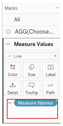
Step 8: Drag “Measure Names” to “Path”.
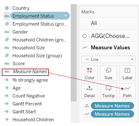
Step 9: Remove “Measure Names” from “Detail”.
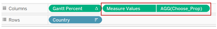
Step 10: Change the sequence of “AGG(Choose_Prop)” and “Measure Values”, to look like below.
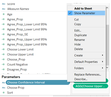
Step 11: Show parameters by clicking on the parameters and select “Show Parameter”. Do the same for all the parameters.
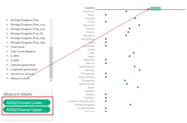
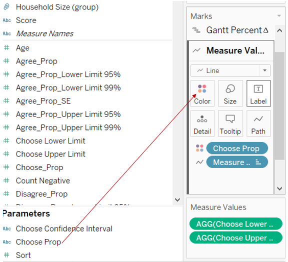
Step 12: To synchronize the colour of the proportion chart with the Gantt chart, drag “Choose Prop” into the Colour Marks card under “AGG(Choose Prop)” as shown below.
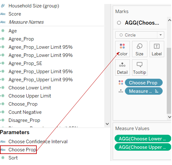
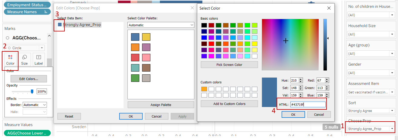
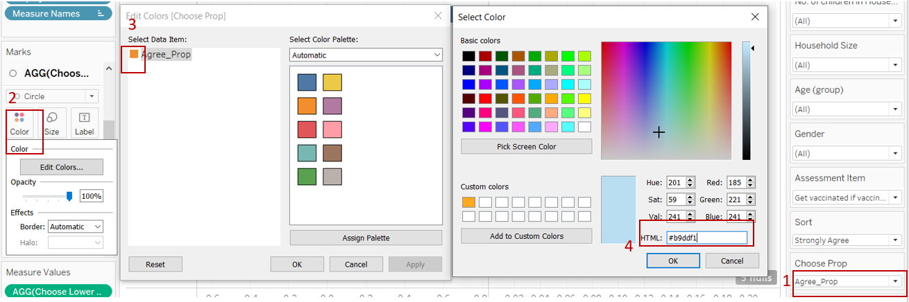
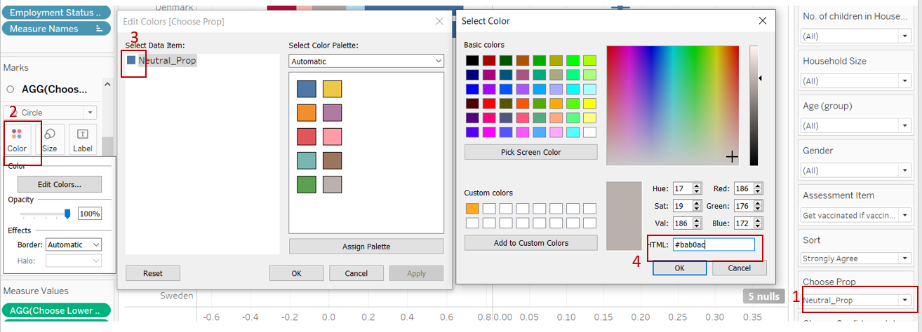
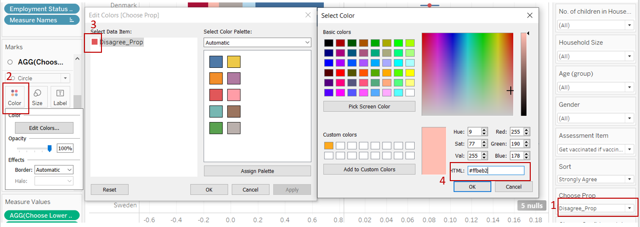
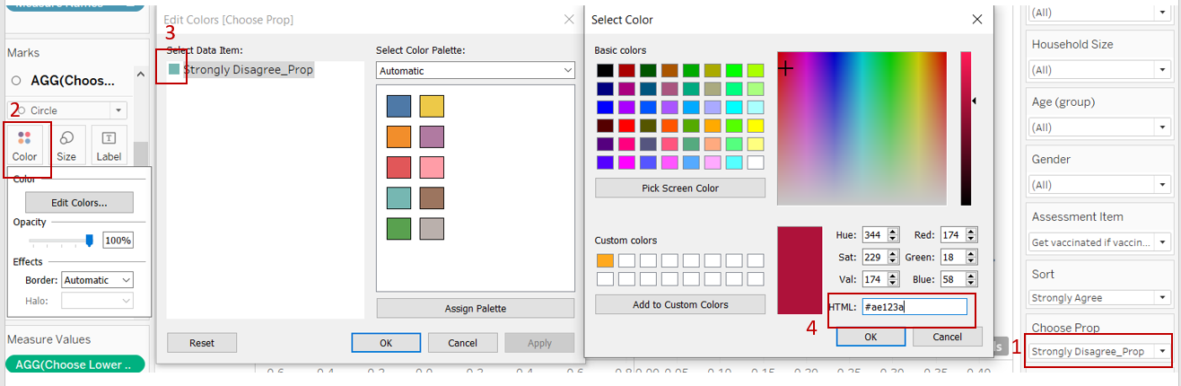
Step 13: In the “Choose Prop” paramter, select “Strongly Agree_Prop”. Click on “Colour”, Click on the colour box and input the colour code as shown. Repeat the same steps to sync the colours for “Agree_Prop”, “Neutral_Prop”, “Disagree_Prop” and “Strongly Disagree_Prop” as shown below.
Step 14: Drag “Choose Prop” into the Colour Marks card under “Measure Values”.
Step 15: Click on the header and unselect “Show Header” to hide the header.
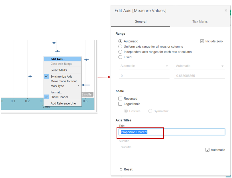
Step 16: Rename the axis by clicking on the axis and select “Edit Axis”. Change the Axis Title to “Proportion Percent”.
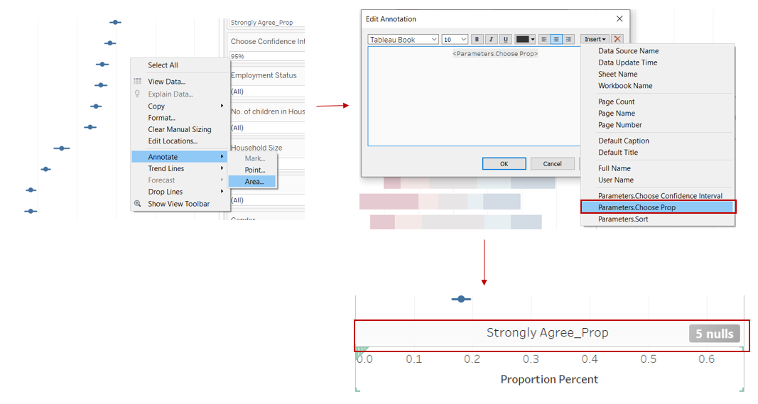
Step 17: Add annotation by clicking on the chart, select “Annotate” and “Area”. In the pop-up window, click “Insert” and select “Parameters.Choose Prop”. Shift the annotation area to be just slightly above the x-axis as shown below.
3.2.4 Create Dashboard
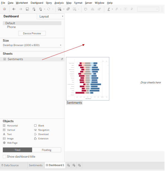
Step 1: Open a new Dashboard tab, drag the worksheet into the pane.
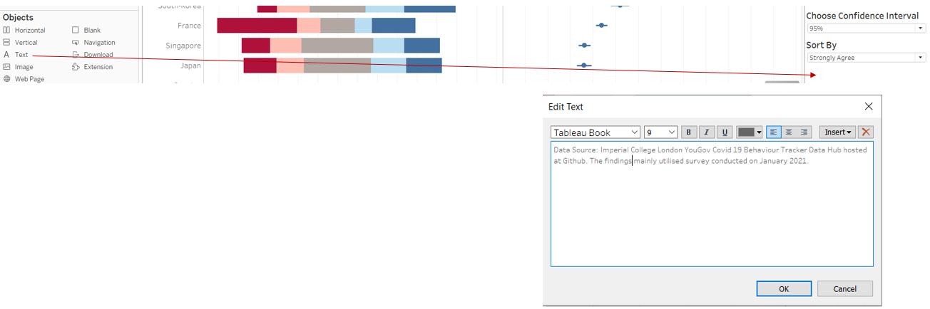
Step 2: Drag “Text” to above the chart and input the title for the chart as shown.
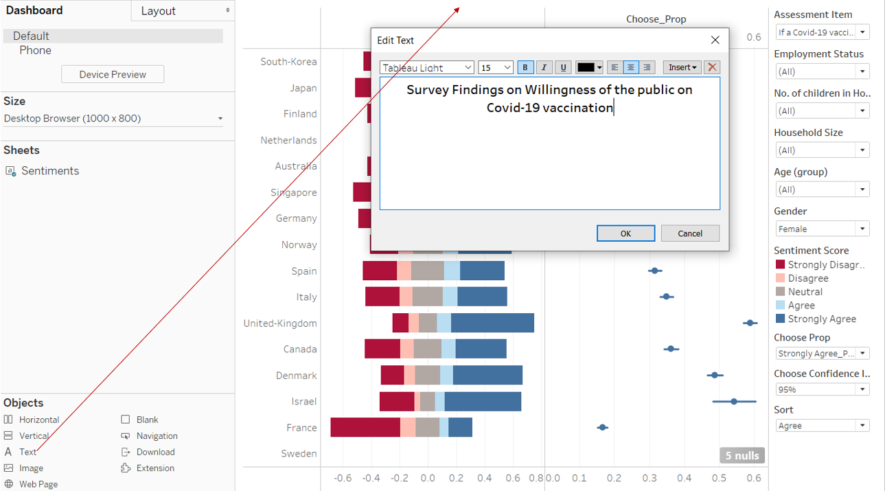
Step 3: Click “Assessment Item” and drag it to be above the chart.
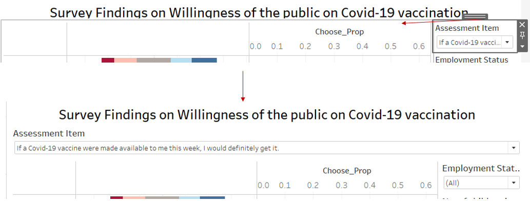
Step 4: Drag “Text” to above the chart and input the data source as shown.
Step 5: Click and shift the filters such that it shows the following layout.
4.0 Final Data Visualisation Output
Data Visualisation Link (Tableau Online)
https://public.tableau.com/views/DataVizMakeoverSentimentsonCovid-19vaccination/Dashboard1?:language=en&:display_count=y&publish=yes&:origin=viz_share_link
4.1 Major Insights
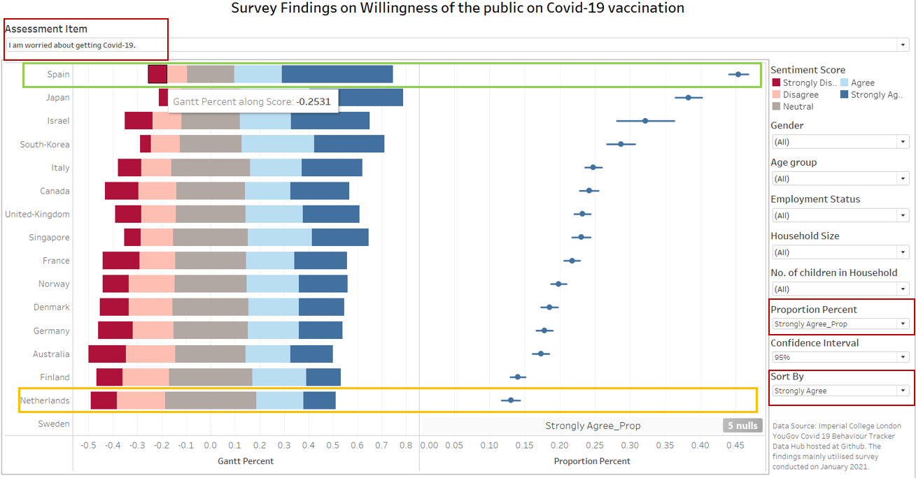
Observation 1
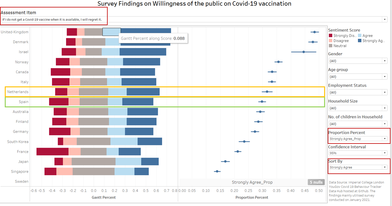
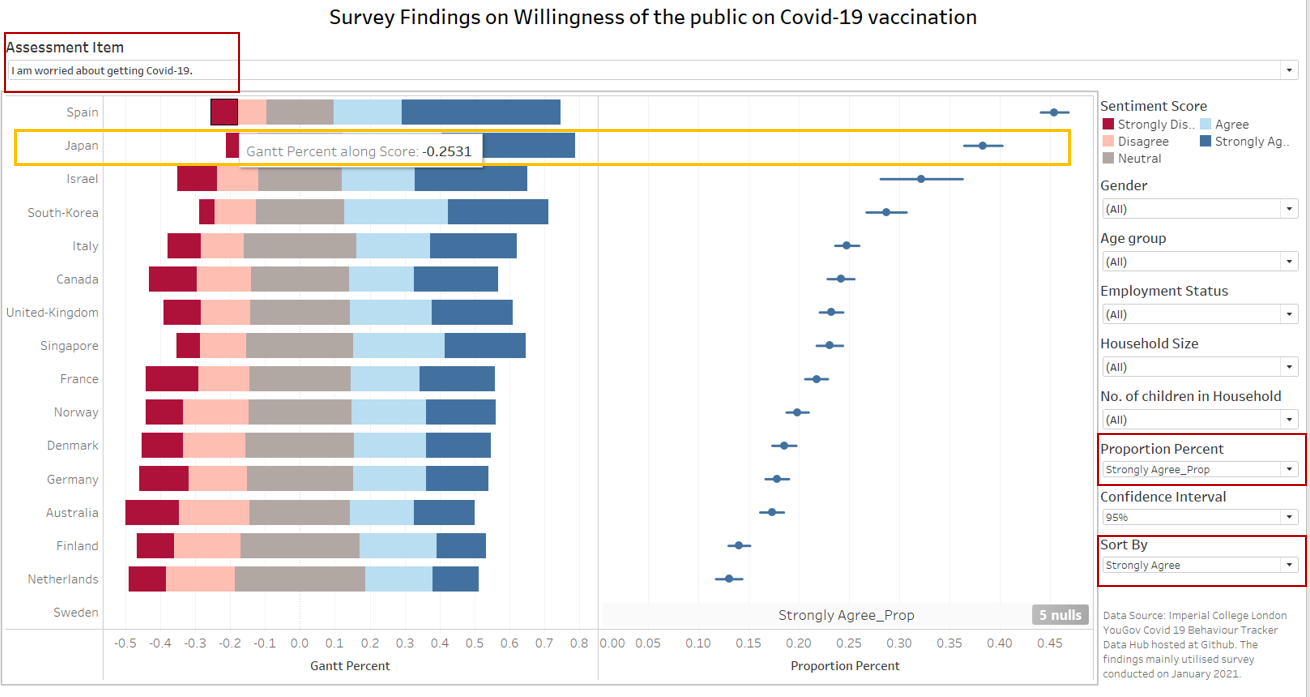
Compared to other countries, Spain (Green box) had the highest proportion of respondents saying that they strongly agreed that they are worried about getting Covid-19. Netherlands (Orange box) had the lowest proportion of strongly agreed.
However, when comes to the question on whether they will regret not getting vaccinated when vaccine is available, Spain had lower proportion of respondents saying that they strongly agreed that they will regret compared to Netherlands.
Observation 2
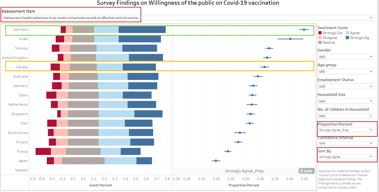
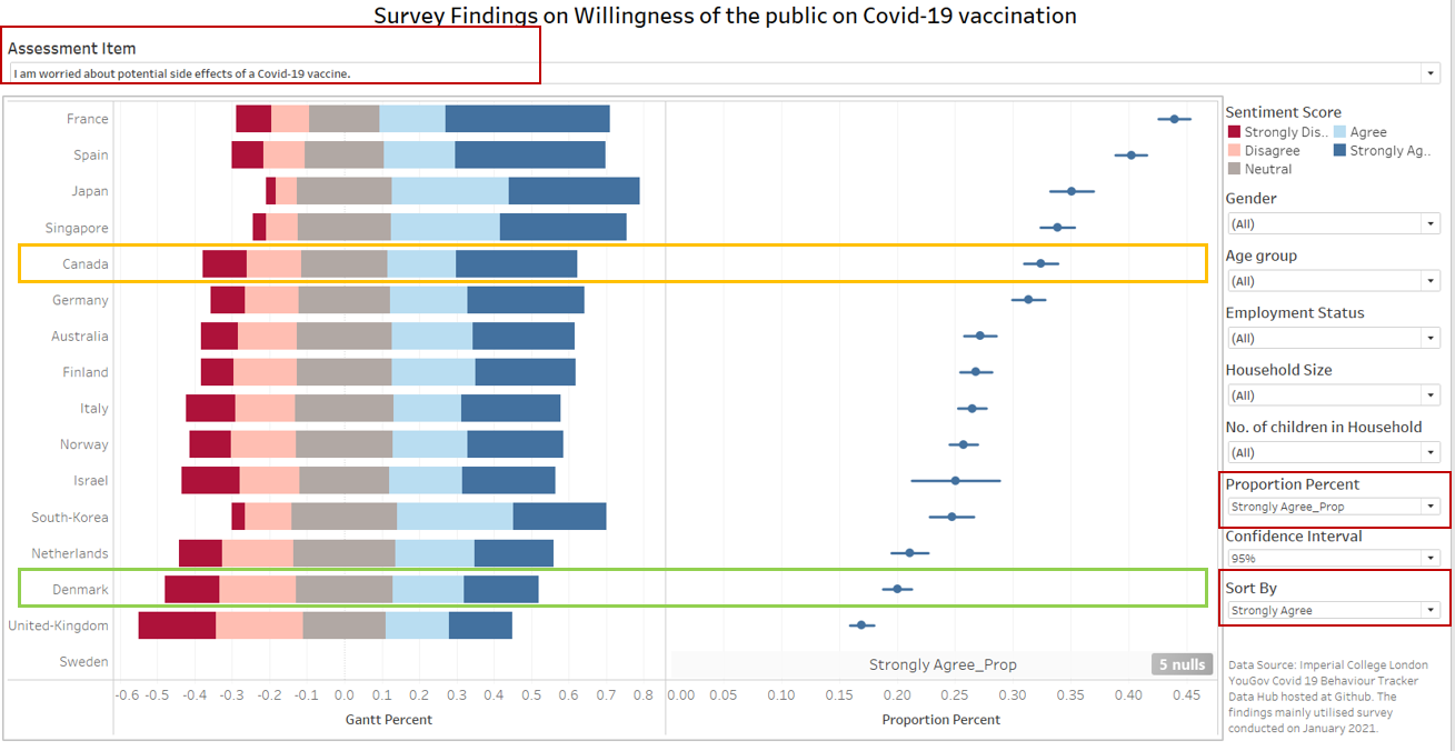
Denmark (Green box) had the highest proportion of respondents who strongly agreed that they believe their government will provide them with effective Covid-19 vaccine, which also translates to lower proportion of respondents who strongly agreed that they’re worried about the side-effects of the vaccine.
However, this is unlike Canada (Orange box) which ranked among the top few countries with high proportion of respondents who strongly agreed that they believe their government will provide them with effective Covid-19 vaccine, yet, Canada is also among the top few countries where high proportion of respondents strongly agreed that they’re worried about the side-effects of the vaccine.
Observation 3
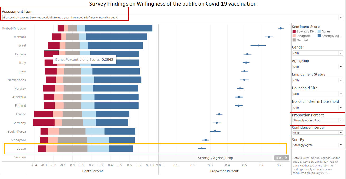
Although a high proportion of respondents in Japan strongly agreed that they’re worried about getting Covid-19, a low proportion of them strongly agreed that they will go for vaccination when the vaccine is made available to them either this week or a year from now.
Hope you enjoyed reading :)